MAC Eyeshadow Collection Series: Blues

Hey everyone! Now who in the world doesn’t like blue right? And being the makeup junkie that I am, I am a serial blue shade buyer. Yup Guilty as charged! I think this is the most shade I have in my collection (I mean when combined with other brands in my entire collection) it’s maniacal! It’s like red lipsticks with me, I just can’t keep my hands off of them.

IMG_4400

Cobalt – This is an unusual primary blue shadow hints of indigo to it. It is a Matte finish but strangely has some shimmer in it. I need a little bit of effort when using this shade as it’s a bit dry so a good eye base is mandatory when using this shade. It’s still a gorgeous shade to me but be warned it is a tad drying after a while of application. Would i repurchase this? Honestly I would have to say, No just because its too dry for me.

Electric Eel – This  is a bright deep cyan blue that reminds me of my high school uniform. It is the exact shade ( you know what I’m talking about my fellow Malaysians! haha). It is in a Satin finish. A lot of people complain that this shade is not a great shade, saying that its patchy and no pigmentation. However, I’m experiencing quite the opposite with this shade. On me it has an amazing colour payoff and blending is effortless.

Freshwater – This is a bright, medium ocean blue. It is in the Veluxe Pearl finish family and is absolutely amazing. It has such an amazing colour payoff and is bold. I generally use this for the lower lash line for a pop of colour. It is an amazing shade for brown eyes in my opinionn!

Atlantic Blue – This is a beautiful deep, intense cobalt blue that has a slight violet undertone to it. It is in a Matte finish but requires  little work when using this colour. The pigmentation is great and in my opinion, is a must-have. This blue has the most amazing and smooth texture for a matte finish. It applies evenly & doesn’t fade or change in colour.

Navel – This is an indigo blue shade with a hint of purple to it. Though belonging to the Velvet finish family, it really is more like a Matte in my opinion. I’m not to hot about this shade. I can say it’s a regret buy. It was beautiful when the MUA put it on for me but I can’t seem to make it work by myself.  It is dry and patchy and the colour never seems to blend well.

Contrast – This is a beautiful navy blue that is perfect for a smokey eye. It is in the Velvet finish family and is absolutely amazing. It’s almost similar to Deep Truth (which is sadly discontinued) but in my opinion slightly lighter. I’ve repurchased this twice because it’s a great sub for carbon whenever I want to add some depth to certain eye looks.

Tilt – This is a beautiful duo-chrome blue shade which has some green and purples in it. It’s in the Frost finishy family and is intense. The colour payoff is magnificent and blending is a breeze. I love love love this shade. It’s another shade I have repurchase twice because I like to pair it with contrast or use it in the inner corners. It’s also fantastic when paired with MAC’s Steamy. I love how smooth and creamy this eyeshadow is. It is one of my all time favourite MAC shade and I hope they never ever discontinue this colour.

Done with the blue on to the next colour of this series. Stay tuned for the purples next. 🙂

MAC Eyeshadow Collection Series: Teals

As promised, these are my teals by MAC. At first I thought of combining this entry with the greens or the blues but then I thought they deserve a separate entry because they are so beautiful. I don’t think the swatches picture does them any justice though because they look pretty much similar. In real life there’s quite a distinct difference but I guess it’s the camera lighting or something that doesn’t want to make the true colours show up.

IMG_4362

Shimmermoss – This is a highly pigmented shade which is in a Veluxe pearl finish. It’s a shimmery blue green shade leaning slightly more to the blue side. I also notice a silver sheen to it and pairs so well with Knight Divine or over black on me.It’s so smooth and easy to work with. I would say the closest colour to it is Steamy.

Aquadisiac – This a light minty aqua shade leaning more to green. It is in a Lustre finish. It is a beautiful colour but if I’m honest I prefer Shimmermoss.

Greenroom – This is a medium-dark forest green with a tealy under tone. It is in a Satin finish. Even though I like this colour, I would’ve appreciate this colour if it wasn’t too dry.

Steamy – This is a bluish green with a slight gold sheen to it. It is in a Frost finish. It is such a beautiful colour and pretty close to Shimmermoss. The difference is really on the sheen but to be honest you don’t need both. They’re both great shades but in all honesty I love Shimmermoss more than Steamy.

I can never say no to teals. I feel teals are so versatile and works well with pretty much any skin tones. I don’t know about you guys but I think teals makes one look young for some strange reason. It just brightens up a face and makes a person looks happier. haha 🙂 Hey, thats only my opinion.

So I will post another colour family tonight or maybe 2. For those interested, stay tuned! 🙂

MAC Eyeshadow Collection Series: Greens

Hi Everyone! It’s a bright shinny day today and I am back with another Eyeshadow series post. Since it’s such a beautiful day I’m going to post a few colour families today. Why not right? I have a tiny obsession with greens and teals. I have quite a bit in my collection (not just MAC ones but the posts will be just for my MAC ones for now 🙂 ) So lets start with the greens and then the rest will follow suit.

IMG_4378

Sumptuos Olive –  This is a beautiful iridescent olive green shadow with a golden tinge undertone. It is in the Veluxe pearl family.It has an amazing colour payoff and is highly pigmented. I personally believe this shade is always overlooked, an unsung hero if you like.  It is such an unusual and a phenomenal colour. In certain angles it looks more golden and in another it looks like a greeny khaki shade. I highly recommend you to try it at the store to have a look for yourself.

Greensmoke – This is a significantly darker olive green with specks of greyish undertones to it. It is in the Lustre finish family and is quite a good one too. Honestly, it is one of the good lustres I’ve come across. Strangely it has great colour payoff;  doesn’t have the usual sheer, uneven payoff or the issues with fall out like Lustres generally do. I’m no fan of Lustres but this one is a good one.

Bows & Curtsey – This a deep forest green with bluish shimmer which is nearly black when swatched on my arm. This is in a Satin finish. I notice some silvery pale teal micro-glitter when it hits the light. If you want the green to be more visible, putting a lighter green eye base helps to bring out the shade. It blends well and the pigmentation is great.

Swimming – I would say this is a beautiful shimmery grassy green that pairs perfectly with blues, teals, golds and purples. It is in the Lustre finish family and another one of the truly good lustres I’ve come across. For the people whom enjoy experimenting with eyeshadows like I do, it just brings out your eyes when doing a funky colour eye look in my opinion. The texture is creamy as compared to the usual dry Lustre finishes that MAC does, so blending this colour out is so easy. There is a hint of sparkle in it but not a scary amount that it falls out every where on your face.

Humid – This is my absolute favourite green of all MAC greens. It is such a versatile colour that you can use as a daytime look and switch it into a dramatic night time look with little work. It is a dark forest green with a sublte gold sheen to it and is in a Frost finish. It’s a medium-dark, forest green with subtle gold shimmer and a pearly finish.

Juxt – This is a light sheer lime greed shade that is in the Satin finish family.I find it especially beautiful when used as an accent especially the inner half of the lid. When paired with deep blue or green shade, it instantly brightens up the eyes and bring the look to life on me.

Sour Lemon – This is a very yellow based green that is almost identical to MAC’s Bitter eyeshadow (only different in finishes). In certain angles I feel it looks more yellow than green on me. It is in the Satin finish family. I quite like this colour but it takes a bit of effort to work with it. I feel using a 139 brush with this shade helps pick up the product to the amount I like and also you need a light coloured base to make the colour stand out. I usually use My MAC Painterly Paint Pot for this eyeshadow when using this for an eye look.

Lucky Green – This is a beautiful bright chartreuse shade which really is a yellow based green with some shimmer in it. It is in the  Veluxe pearl finish family and is absolutely amazing! This is another favourite green of mine that I originally acquired from the Belle Azure collection (2005). At one point I was obsessed with it! Thank the makeup gods it is a permanent colour now. 🙂

That is the greens in my collection done. I hope this entry will be helpful to those whom would like to start a collection. There are so many shades of greens out there so you should always still try and swatch them on you to have a feel. As much as reviews are awesome to read and looking at pictures to have a sense of what it may look like, it could turn out completely different on you. So my two cents worth is always try before you buy. Anyway, my next post will be for Teals, so moving on now… 🙂

MAC Eyeshadow Collection Series: Greys

Hello everyone.  Today I’m posting the grey shades of my collection. I love my greys and these have been repurchased time and again (except for Carbon). There’s something about greys that draws me to them. I love that they brighten up my eyes and are amazing for smokey eyes. Not to mention they compliment most purples, pinks blue and browns on me. It is even great to wear alone, paired with a cat eye when I’m not in the mood for the usual neutrals for work. I seriously think greys are less boring for a one shadow eye look. I started my collection with these greys because I was into the Marilyn Monroe retro look for a while back in 2008. Now, I use these shades mostly for a one shade eye look .

IMG_4390

Vex – This is an unusual colour but the picture does not do it any justice. In real life it has a light silvery greyish pink and very subtle green tones to it. It is in the Frost finish family. I think it’s a versatile colour and amazing but I feel its never really mentioned. It is one of my favourite shades for all over the lids or a blending out shade for purple shadows.

Scene – This is a dark gray that lean more to purple. It is a great grey shade in the Satin finish family. The thing I like most abour Scene is that it has no glitter or shimmer in it which I think is difficult to find in greys. Also it is super pigmented.

Print – This is a warm charcoal grey in a Satin finish. It’s very smokey but is not so easy to blend in my opinion. I’m not the biggest fan of this shade to be honest because of the time needed to blend it out.

Electra – This is a light-medium silver with a metallic sheen which is in a frost finish. The colour payoff good and it applies smoothly. It has an intense pigmentation and amazing for a night-time smokey eye. The consistency is so creamy  that makes blending a dream.

Knight Divine – This is a dark, lead-pencil coloured grey with a blue tinge undertone to it. It is in the Veluxe Pearl finish family and  has a metallic finish. It is very soft and pigmented and goes well with Electra.

Silver Ring – This is a mid-tone silver which is in a Veluxe pearl finish. I love how it blends well and has a very soft, smooth texture. I like to pair this versatile colour with Print or Scene. It’s close to Knight Divine, just slightly lighter and has a more icy-grey undertone.

Carbon – This is plainly put, a black shade which is in a Matte finish. Truth be told, it is not the blackest black eyeshadow I have encountered or own and it is not the easiest to blend out.Plus it is quite patchy when applied so you need to be patient to work with this shade. For the price you pay (plus the recent hike in MAC product prices), I would suggest looking for a different brand if you want a black eyeshadow. You can find a better black shade at a cheaper price. Failing which if you really want to own Carbon, wait for the collections because for some strange reason Carbon will always make an appearance in at least one quad or a set of a collection.

So that is it for my MAC greys. It’s a great idea to have some greys in your palette because it would suit any skin tone or eye shape in my opinion. For a dash of glam, draw a cat eye and slap some red lippie,and you are set. So I hope you enjoyed this entry and will post more soon. 🙂

MAC Eyeshadow Collection Series: Neutrals

Hi everyone. It’s time for another MAC Eyeshadow Series entry. Today is all about my neutrals. I know a lot of people love neutral shades for work or school so maybe this will be great for reference for people who are intending to try MAC neutral shades. On to the eyeshadows now..


IMG_4379

Gleam – This shade is a peachy pink shade that has quite a bit of chunky shimmer. This is in the Lustre family. Truth be told I don’t really use this shade as an eyeshadow much because of the amount of fall out. It’s no secret I am no fan of Lustres. However, because I didn’t want to waste it, I tried as a face highlight and it wasn’t that bad. I wouldn’t repurchase this colour because its so difficult to use for the eyes and there are many more great face highlights out there.

Jest – This is  nice light-medium peach living in the Frost finish family. I know it doesn’t look like much in the picture but when doing bold eyeshadow look, this is a perfect eye brightener colour to add in the combo.  I also like ot use this on the lid when I do a cut crease look with some other neutral shades.

Soft Brown – This Matte eyeshadow is one of my favourites. Its a nice golden tan-ny peach brown. On me it had some orangey tinge to it as well but not stark orange. And the fact that it is a matte is fantastic. I love this as a transition shade and a crease colour. It’s so versatile you can pair it with any shade you can think of in my opinion. It’s one of my staples.

Wedge – Another fantastic Matte finish shade. It is a beautiful mid tone taupe brown which I use also as transition or in the crease. Sometimes I also mix this shade with espresso for my brow colour.

Coquette – I know it doesn’t look much of a shade to have in the picture but it truly is a unique colour on the eyes. It is a universal khaki colour which in certain angles also looks like an olive shade. It is in the Satin finish family. If I’m completely honest, sometimes I feel it looks like the colour of vomit you see in cartoons. haha But I still think it’s a fantastic colour to own.

Omega – This is a mid to light toned cool brown, with a subtle ashy grey undertone. It is a Matte finish shade that is a great crease colour for me. I have repurchased this shade and generally hits pan about the same time as soft brown.

IMG_4365Embark – This is a dark red brown with a plummy undertone to it. It is a matte eyeshadow which is really pigmented. I love this colour because it’s such a versatile colour. I use this colour for mostly to deepen the outer corners of an eye look or for under the eyes. It’s also beautiful for a one eye colour look as well.

Espresso – This is a cool toned medium brown which I like to use for a simple smokey eye. The colour pigmentation is great and it is a great shade for my eyebrows as well. This is also a Matte finish shade.

Bronze – It is a rich, dark bronze with a warm, golden sheen. It has a frost finish. As much as I love this colour I think there are other beautiful bronze shades similar to this shade. Against my olive skin I need to add another colour for depth to bring out the colour, so I generally mix embark or club at the outer corners of my eyes.

Satin Taupe – This is one of my favourite shades which I feel is so versatile and easy to wear. It’s a purply, grey, brown colour with a silver shimmer taupe and has a Frost finish. Seriously I love this colour!It’s so easy to use, blend and really great for every day look for work if you don’t like the whole fuss of having to concentrate doing an eye look.

Club – This is a beautiful duo-chrome shade that looks one minute, like a gunmetal gray with teal highlights and in another angle looks like  the next, a purply  brown with an iridescent green glow. When I first saw it in the pan I was intrigued (aahh yess another vomit colour) so I swatched it. I immediately fell in love with it.

Era – This is a soft golden beigey taupe and is a Satin finish. It’s not a colour I always reach for all over the lids because I mainly use it for blending out.

Sable – This is a bronzy golden plum and is in a Frost finish. I would generally use this as a crease colour. Do I love it? Well honestly I have a love hate relationship with it. I will have a phase of using it on a stretch and then I just dont reach for it so much,

Charcoal Brown – This is a medium-dark, grey tinted brown which is in a matte finish. I would use this as a crease colour mainly or for some depth. Again I feel you can find something similar at a cheaper price these days so it is worth investing sometime to swatch it first and have a feel.

Mulch – This is a reddish-toned brown with a golden sheen. It is in a Velvet finish which is beautiful to me.  I feel this compliments purple eye looks and I like to use this in the crease or under the eyes.

Ok, thats it for the neutrals. I think the next colour series will be my greys which I will post later today or tomorrow. I hope everyone has a nice day today. 🙂

MAC Eyeshadow Collection Series: Highlights

I’m going to start of the series with some highlight shades I have in my collection. I group these shades with my neutrals and transition shades in my palette. This is the palette I generally reach for on a daily basis and has items that have been replace time and again over the year. You can say it’s like my basic palette, if you like. 🙂 Ok now on to the shades.

IMG_4380Vanilla – I would call this an ivory shade with slight subtle pink undertones which is barely noticeable. It is in the Velvet finish family and  I love this colour. I think is the best highlighting shade for my olive skin tone.  It applies and blends extremely well and goes with pretty much anything. This is a shade I have replaced time and again and has become a staple.

Shroom – This is a  beige shade that has some shimmer. It is in the Satin finish family and on me it leans a little bit on the yellowy tan side. Many people say it’s a neutral shade but it doesn’t translate that way on me. Also a favourite and a staple for me which I find best compliments when I do a green or purpley smokey eyeshade.

Phloof! – This a light pinky beige which is in the Frost finish family. The formula is phenomenal and is super pigmented, so caution when dipping in that brush. I also like to use this as an inner corner highlight other than the brow bone. 

White Frost – This is a white, plainly put, also from the Frost finish family. I must say it is the least reached shade from my palette because it is quite a stark white colour. I can’t remember why I bought this shade but I try to at least wear it once in a while.

Nylon – This shade translates to me as a yellowy shimmer. It has intense amount of shimmer and I love how it brightens up my eyes. It works best for my inner corner as well as my highlight. Gives my eyes a fresh look somehow. Definitely another staple for me! 🙂

So to go by rank, I would say Vanilla is my ultimate favourite, followed by Nylon, Shroom and Phloof!. Would I repurchase these babies? Yes, definitely and I have repurchased them! I know the photo doesn’t really show the significant colour difference but it really is different when you see it in person and swatch them yourself. However, I would strongly suggest you to try these first incase you are contemplating to buy any. From personal experience, I feel it is different on every skin tone even if you have a similar olive skin tone like mine. Thats it for today and ‘till we meet again tomorrow for the next entry of the series, have a great day everyone. 🙂


MAC Alluring Aquatic Collection

Hello everyone. I have some time to kill since it’s my day off today. I had a number of errands I needed to sort today so I took leave from work. Now my Eid prep is left with just making the food for the big feast. So I thought I’d squeeze in another makeup review today!

Clearly for many parts of the world, this collection launched in May, but as I said in many of my previous entries, we’re always slow to get them in and most of the time we don’t get the whole collection. The same happened with the MAC alluring Aquatic collection. Not all the eyeshadows came and obviously it’s the colour that I wanted. Anyway, one does not want to ramble too much so lets get to the goodies.

This collection arrived at my door step last week. Thank you so much to my MUA for sending this to me and I’m loving the collection. However with every collection there’s always a hit and miss but we’ll get there. 🙂

IMG_2528

This collection is big one. It comes with eyeshadows, bronzers, lippies, brushes and the works but I only chose the things I know I would wear.

Lets see the packaging. Can I just say, the packaging is so beautiful. When I first saw the promo pictures I wasn’t too impress but I quickly changed my mind because it really is amazing. The pictures didn’t do them justice, in my opinion. The packaging is a metallic teal in colour with embossed water droplets. So it’s not like a regular droplet image slapped on the package. When I look at the packaging, I instantly think of mermaids and can I just say, it seems to have a calming effect on me. 🙂

1

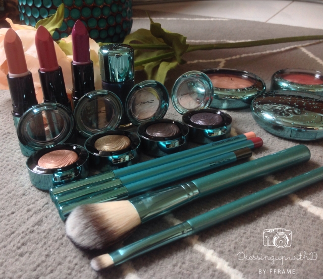
Next is the brushes. This collection has 2 Limited Edition brushes, the 127 and the 233 brush and they also came in teal  to match the collection.

1. 127 Split Fibre Face Brush

This is a medium size bronzer/blush brush. It isn’t the most softest brush but it does the job. Personally I use this brush for blush only. I just feel the shapes suits applying blusher rather than bronzer. Its made out of synthetics and natural hair and has a metallic teal ferule and teal satin finish handle.

127 Split Fibre Face Brush

127 Split Fibre Face Brush

233 Split Fibre Eyeshadow Brush

This is an eyeshadow brush. Personally I like this kind of brush for powder base eyeshadows and for all over the lids application. It has a squarish shape made out of synthetics and natural hair. It is a beautiful brush, that has a metallic teal ferule and teal satin finish handle. Its similar to the 239 brush except it has split fibre bristles.

233 Split Fibre Eyeshadow Brush

233 Split Fibre Eyeshadow Brush

On to the Lipsticks.  I got 3 of the lipsticks from this collection. My personal favourite is Mystical because I find it to be such an easy shade to wear for everyday use. The three colours I got are Enchanted One, Mystical and Goddess of The Sea.

IMG_2955Enchanted One  is a peachy coral pink shade.On me, the pink is more apparent and leans towards a rosy pink. The shade was quite opaque on me but I found it to be a little bit drying maybe because it is a matte finish lipstick.

Mystical is a rich rosy pink with a luminous sheen.I love this cremesheen shade (I love cremesheen’s) not only because it applied smooth, it is also opaque in coverage. I find it to be a really versatile colour.

Goddess of The Sea is a plummy violet. Again, another cremesheen shade with a really opaque coverage. It is  also creamy in its consistency so I didn’t have issues with dry lips.

IMG_3182 Next is the Extra Dimension Eyeshadows. I must admit I like this formula for eyeshadows. The colours are always so beautiful and has a beautiful finish when you apply it to the eyes. This time the eyeshadows didn’t fall short in the colours either. I got 4 shades out of the collection which are Fathoms Deep, Soul Serenade, Sea Worship and Lorelei. IMG_2873

Lorelei is a peachy gold metallic hue with very subtle shimmer. The texture is smooth and buttery. It some angels I feel it looks more tanned. I like to use this in the inner corners of the eyes just to brightened it up. However, I did experience some significant fall out with this shade.

Sea Worship is is a metallic dirty gold with hints of tarnished green in it. It reminds me a green khaki shade with subtle shimmer. It is one of my favourite shades in this collection. It has an amazing colour payoff and is so smooth.

Soul Serenade is shimmery deep greyish burnt brown. There are hints of plum with micro glitter in it and I think its a unique colour. The colour pay off is amazing and i didn’t experience much fall out.

Fathoms Deep is a multi coloured dark grey shimmer. It is like a gunmetal metallic finish hue with a bluish purple base. Another one of my favourites in this collection however there was a smidge of fall out. Even so, it applied so smoothly on the lids.

I also received the some pencils, bronzers and nail polish.

Powder Bronzer in Refined Golden I do believe this is a repromote featured in the Temperature Rising collection. I didn’t get it back then but this time I have it. It is a golden orangey shade with a hints of brown in it. It leans more towards orange on me so a little does goes a long way. It also has some gold pearlesque shimmer in it. IMG_3219IMG_3220 Bronzer in Aphrodite’s Shell Aphrodite’s Shell is a golden bronze shade with a brown tinge to it. I think it goes well with the Refined Golden bronzer because it has a luminous finish. I dont really see this as a bronzer, more like a Minerealize Skin Finish. Its quite light on me so to wear it on its own I need a little work with it. IMG_3217IMG_3218 Blush in Sea Me, Hear Me This blush is described as a muted coral pink but somehow looks nothing of the sort on me. It is rather more a pinky brown with reddish undertones on me. It has a smooth and soft texture with a fantastic colour payoff. It was also so easy to blend out. IMG_3226 IMG_3221Last but not least, the liners and polish. Out of this lot I’m loving the nail polish the most. It truely does have a mermaid vibe to it. 🙂 I love that it is a dual tone shade. IMG_2874Submerged is a dual tone chrome polish. It’s a medium dark blue shade with some teal micro shimmer. In certain angle I see a significant amount of purple to it. Black Line is a dirty golden olive eyeliner that leans towards black. It has some shimmer to it so for people with sensitive eyes, I don’t think it would be kind to the waterline. I think its a great shade for a smokey eye, for instance paired with sea worship eyeshadow. Now, the lip liners. There are two shades which is Half Red and What Comes Naturally. Half red is a plummy rose lipliner and What Comes Naturally is a light peachy nude. They are both in a matte finish and are highly pigmented. There was a bit of dragging when I tried it on but nothing a lip conditioner cannot fix. Overall, I love the eyeshadows and the Nail polish. The eyeliner was alright, just that I didn’t really like the shimmer  so much. I also believe you can still get some of the items on the MAC Malaysia website but I’m pretty sure the eyeshadows are sold out. Ok thats everything from the collection that I have and I hope you enjoyed this post. till next time have a great day everyone. 🙂

Urban Decay Electric Palette

IMG_2518

Hey Everyone! How you folks doing today? I just came back from a work related travel escapade (hence the slow in posting of late) and I’m beat! Work is hectic again since everyone is about to go for a long holiday for Eid, so there is a big rush in getting things done. Anyway, I stopped by Sephora on my way back from the airport because the train I was to change for was in a Mall. So I thought I’d mosey in and see if the long awaited Urban Decay Palette finally came in….and it DID! I cannot believe how long it took to get this palette. I’ve been drooling over the pictures for a loonnngg time and FINALLY I have my own palette to play with! So, since I have some daylight for pictures still, I thought I’d sneak in a post before I have dinner and crash. 🙂

IMG_2984

In all honesty I cannot wait to play around with this palette. The colours are just so bright and beautiful. I am beyond excited that I have this in my possession (What DRAMA Eh?? haha), every colour is so….plainly put, ELECTRIC! Everytime I open the palette all I can think of is ‘Va VA Voom!’ haha. The packaging alone is so beautiful, with what looks like burst of colourful neon smoke.

This palette houses 10 exuberant neon pressed pigment hues. The colours are true to pan and oh so vivid. Out of the 10, there are 2 repeats. Personally, I only have one of the repeated colour which is Chaos. This one came in the Vice 1 if memory serves right. Another repeat is revolt. Now, let me be frank. All these colours are highly pigmented except for Revolt (in my opinion at least) and some stain a wee bit. Also, some of the colours have been put with caution not to be used on the eyelids. Urban Decay always equips its palette with a sizeable mirror, which this one had as well and with a dual ended brush.

IMG_3004

So lets get on with the colour break down. I’ve swatched these babies with a base mainly because I would always use a base for eyeshadows because I have supremely oily lids. To be honest, because it’s ridiculously pigmented, some may want to skip the eye base.

Processed with Rookie

Revolt is metallic shimmery silver colour with some micro glitter in it. This one has a significant amount of fall out, probably because of the micro glitter. Like I mentioned earlier, its a repeat colour from the Anarchy palette (which btw, I don’t have). When I was swatching this on my hand, I realised that it needs a little bit of work to build up the intensity of the colour. I’m thinking it’s because of all that glitter. It is the least favourite of mine in the line up but still has a significant more pigmentation to most micro glitter eyeshadows I own.

Gonzo reminds me of my high school uniform (yup we have uniforms here for public schools!), yet still an amazing shade. Its a medium blue that sometimes can be mistaken as a bluish turquoise which is absolutely vivid. It has a matte finish  with a slight flex of silver micro shimmer. You barely notice it but its there. Texture wise it’s really soft but landed a tad powdery.

Slowburn is a fantastic vibrant orange. It a mate finish a red tone orange which is superbly pigmented. I can see this will eventually be my favourite orange even though it is advisable not to be worn on the eyes. Strangely, slowburn wasn’t powdery at all. It is incredibly smooth when I swatched it. I plan to give it a try anyway (at my own risk) because I just don’t understand why would you make an unsafe eye colour in an eyeshadow palette? It really doesn’t make sense to me.

Savage is another amazing hue. It is a hot magenta pink with a matte finish, Again, this eyeshadow is so soft and smooth but needed a tinsy-insy bit of work to build the pigmentation. Nothing major just a tad bit (lesser work than revolt). However, this shade stains. So a base is most likely recommended if you ask me. 🙂

Fringe is my favourite! It is a beautiful metallic teal, like a peacock teal. It has such a rich buttery texture that ends with a frosty finish. Yet another highly pigmented/vivid shade. It’s my perfect teal!

Processed with Rookie

Chaos is a repeat from the Vice palette but with a better formula. It is a cobalt blue with tiny hints of iridescent shimmer to it. Comparing it to the older version in the Vice, this time around it is so much softer and is less powder. Plus, its easier to build for pigmentation. Chaos is also a matte finish.

Jilted looks like a darkened Savage in this picture, but I promise you it is not (I was losing light at this point already)! Jilted swatched as a dark berry tone fuchsia with a purple tinge to it. It is such a unique colour because when you move it from side to side (while swatched on my arm) I saw blueish hues creeping out. 🙂 This shade has a frost finish and is amazingly soft and buttery, plus is ridiculously pigmented.

Urban came off as a metallic purple with a pink undertone to it. It is an amazing frosty finish shade with such a soft and creamy texture. t first glance it reminded me of MAC’s pigment in grape but its not because grape has a red tone to it. This shade also didn’t not disappoint in colour payoff!

Freak is a minty green shade with a golden sheen. Also a frost finish shade with smooth and a buttery texture. This such a fresh colour that brightens up the face and I love it. Normally light colours like this appear to be somewhat patchy but Freak did nothing of the sort.

Thrash is a lime green bordering to a vibrant chartreuse hue. I see some gold flex in it as well with a yellowish undertone and is in a matte finish. It is slightly powdery but nothing to worry about because it still had a great colour payoff. I would think this will pair beautifully with NARS Soft Shadow Pencil in Celebrate.

IMG_2902

Last but not least, a special mention to the taklon dual ended brush that comes with the palette. I love this freebie. One side is the eyeshadow brush and the other is a smudge brush. It really does work well for applying the eyeshadows.

Round up of the shades:

  • Mention with caution for the eyelids: Slowburn, Savage, Jilted, and Urban
  • Personal Favourites: Fringe, Slowburn, Freak and Gonzo & the free duo brush
  • Personal Let downs: Revolt

So thats it for the review of the long awaited Electric palette. I’ve got to hand it to Urban Decay for making the most stunning neon shades that wasn’t short of matte and metallic eyeshadows. For bright eyeshadow junkies, this is a fantastic palette to own. I cannot wait to play around and create eye looks with this palette. Maybe, if time and my creative side permits, I’ll post some pictures of eyelooks I’ll do with this palette.

I hope you guys enjoyed this post. I will be posting a few more makeup related posts in the next couple of days because today a few parcels arrived as well when I got home. 🙂 Till the next post, hope you folks have a great day ahead and happy weekend! 🙂

XO

DUWD

ZOEVA Brush Review: The arrival

IMG_1778

Quality Control Cards

Hey everyone! Guess what arrived in the post today! After weeks of waiting for this package it finally arrived all the way from Germany. It’s the ZOEVA brush set in Rose Golden that I have been lusting for. I had to get it online and finally it arrived! I’m going to break this post into 2 parts. The first part is just with loads of photos and some first impression notes. Part 2 will be up sometime next week because I like to try out new brushes first. Normally, I can more or less gauge how much I like the brushes after a few days of wear. So in this part I’ll load on the pictures first. I was drafting my wish list and in one of them is the this set. haha.

The Zoeva Parcel

The Zoeva Parcel

So let me start with the overview i.e purchase and shipping. In Malaysia, we don’t have the ZOEVA set or single brushes easily available for purchase. So far, I’ve only seen them on Luxola but they don’t have this particular brush set that I want. They only have the basic sets and single brushes which are obviously sold out. So, I went over to ZOEVA’s website hoping that they would ship to Malaysia. Thankfully, they do! Payment must be done via PayPal so its safe. 🙂 I waited slightly more than 3 weeks but because they shipped via DHL I was able to track the parcel every step of the way. It took a while for custom clearance but it arrived safely on my desk today and I was totally stoked! 🙂

Bubble Padding Protection

Bubble Padding Protection

It took a lot of will power for me to not rip up the box to see what was inside. I had so much work today so I knew had I opened it I’d be ogling over it so I persevered. Once I reached home I didn’t wait to sit down and went straight for the scissors and opened my parcel. Inside the box, the package was wrapped with black tissue paper and protected with a bubble padded sheet. There were also quality control cards, which I thought was a nice touch. Stating the names of the compiler and the packer of my brushes gave a sense of human touch to me. I was imagining  these 2 people preparing to ship my parcel.

Black Tissue paper

Black Tissue paper

Plastic Protection

Plastic Protection

There were 2 bags that came together with this brush set. One was a brown clutch brush bag, where the brushes were place in and extra fabric bag which I think is meant for large facial products such as moisturisers and so forth. Truth be told, I would probably use it to protect the nice clutch bag.

IMG_1777

Brown Clutch Brush Bag

IMG_1709

Brown Clutch Brush Bag With Brushes

IMG_1780

Fabric Makeup Bag

There are 8 brushes that comes together in this set. I won’t go into detail about the brushes here because that’ll be more in Part 2 of this post. These brushes consists of talon and natural hair bristles. Oh, did I mention they are ridiculously soft? I think they are even softer than the Sigma brushes I have. As a rule of thumb, I always wash all my new brushes before I use them to remove any plasticky smell and dust. They are now drying and I can’t wait to use them tomorrow.Anyway, that’s it for now. I just can’t wait to test out these brushes and post the second part of this post.

IMG_1708

8 Piece brush set

IMG_1704

8 Essential Brushes


NARS Lipstick Pencils

Hey everyone. I have a lipstick pencil type of review/swatch to share today. 🙂 I am a big lipstick junkie and am totally in love with the NARS lip Pencil. I love that it is versatile enough to be a lip pencil as well as a lipstick. I love NARS products and have been a NARS junkie for over 10 years. NARS opened its doors to us Malaysians last year and has put an end to my misery to find online stores that would actually ship to Malaysia. (Thank you makeup gods!!)I discovered NARS when I went abroad to study and was totally in love with their blushers. Now have fallen in love with their lipstick pencils as I like to call them. 🙂 Hope you guys enjoy this post and find it helpful incase any of you are interested to purchase these babies.

IMG_8607

NARS Lipstick Pencils

1.Bolero-Velvet Matte Lip Pencil

Bolero

Bolero LP

Bolero

Bolero came of as a brightened pastel flamingo pink on me. It was more coral than pink so I wouldn’t say its a cantaloupe colour on me. I love the pastel colour that came off on my lips but it was a tad drying after a few hours of wear. It is a matte textured lip colour however applied semi opaque so I had to layer a few coats to get the colour intensity that I liked. Another bummer is that it sinks into the lip lines so I needed to make sure my lips were extra moisturised before application.

2.Dragon Girl-Velvet Matte Lip Pencil

Dragon Girl

DraginGirl20

Dragon Girl

Dragon Girl was described as a siren red on the website and I totally agree. That’s exactly how it turned out on me, though the picture doesn’t do it any justice! It is a cherry red with hints of pink in it. I love this colour! It has a matte finish to it but is not drying at all. Not only does it brightens up my face it also has amazing staying power. It applied opaque so I only needed 1  layer.

3.Majella-Satin Lip Pencil

Majella

Majella2

Majella

Majella was one of the first lipstick pencil I bought from the range. It has a satin finish to it and described as a garnet red colour. In certain lighting it looks like deep berry-ish colour. It also has an opaque colour payoff with a high shine to it. If ever I don’t feel like a full face makeup action, I’d grab this colour and do a simple cat eye. I’d also pat a bit of the colour to my cheeks for a wash of colour so i won’t look so drained out.

4.Luxembourg-Satin Lip Pencil

Luxembourg

Luxembourg2

Luxembourg

Luxembourg is a depended fuchsia red that comes off slightly pinker on me. Sort of like a dragon fruit colour. It has a satin finish and is very opaque. Though the formula is very creamy and soft, it does stain quite a bit of the lips and takes a bit of effort to remove.

5.Damned-Velvet Matte Lip Pencil

IMG_9752

Damned2

Damned

Damned is a matte finish lip pencil that I find comes of more of a plummy jewel toned crimson with hints of purple in it. It isn’t really opaque but is buildable. It’s a really wearable colour and isn’t as scary as the name portrays it to be. It is pigmented enough but still doesn’t come off over the top.

6.Cruella-Velvet Matte Lip Pencil

Processed with Rookie

Cruella

Cruella

Cruella came off as a vampy red with hints of burgundy on me. It is such a rich colour and has become one of my favourite reds Plus the name is awesome! 🙂 Many people describes Cruella similar to MAC’s Ruby Woo but it didn’t look anything like that on me. I like that the colour is opaque only with one layer and didn’t stain my lips nor did it set in my lip lines.

7.Yu-Satin Lip Pencil

Yu3

Yu

Yu

Yu is a fantastic pink! It’s a bright neon pink that has a satin finish. It is a blue based bright pink which is so intense and vivid. I love that it brightens up my face and is such a versatile colour. I compared it with NARS Schiap and I feel that this colour is more intense.

8.Timanfaya-Satin Lip Pencil

Timanfaya2

Timanfaya

Timanfaya came off as a bright orange on me. It had a tinge of red undertones in it that reminds me of a ripen papaya fruit. It is in a satin finish and overall moisturising. It did leave a little bit of stain to the lips and has an opaque colour payoff. Though it is in a satin finish, I did notice it gradually turning matte after a few hours. I found that a little bit strange but a good kind of strange. 🙂